There is an artist book tradition based on the alliance of literature and visual art, from William Blake to Cendrars and Delauney's 1913, La Prose du Transsiberian et de la Petite Jehanne de France. In both cases, the distinction "artist book" stems from the interdependence of the written and the visual, in book form (as opposed to a text with supporting illustrations or vice versa).
When considering a definition of "literature,” Jonathan Culler writes, "We can think of literary works as language with particular properties or features, and we can think of literature as the product of conventions and a certain kind of attention." [1] So, literature (and I would suggest the artist book as well) is at once, defined by properties exhibited in the form as well as the attention authors or readers/critics give the form as "literature" or as an "artist book.”
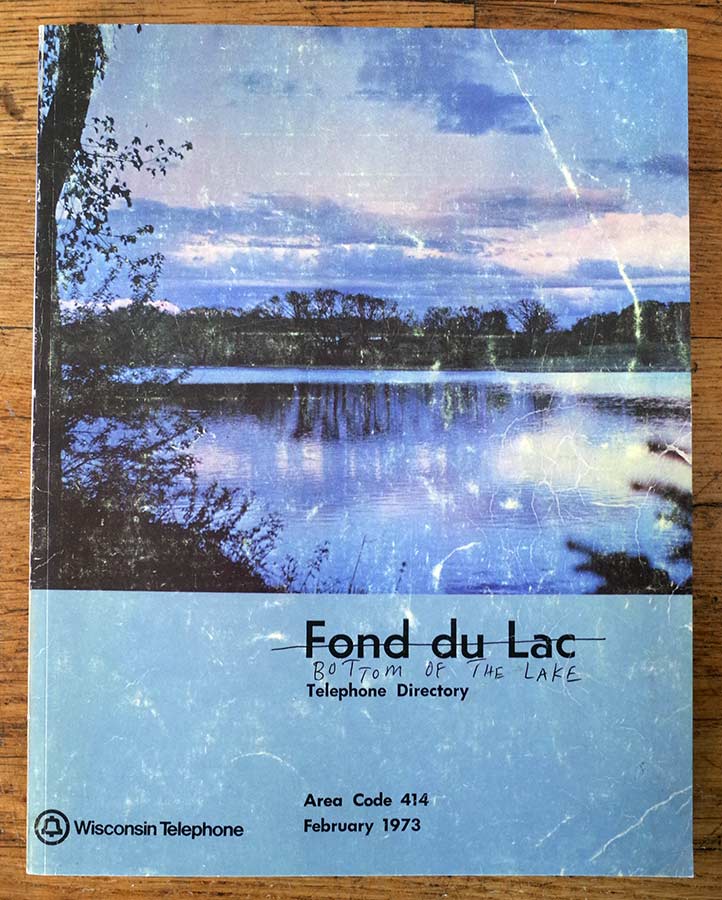
I would like to examine how the artist book might work to extend what we understand as literature. For example, Christian Patterson's Bottom of the Lake is a facsimile of an altered phone book and yellow pages. This most functional, utilitarian form in Patterson's hands becomes a humorous, semi-narrative, pathos filled, portrait (of a town in Wisconsin) and self-portrait of the artist.
Relating to the idea that literature can be defined by the attention that is given to it, on page 2 in the upper-left corner, is the letter range ALB-ART. However, the letters ART are circled by hand, thereby transforming the starting letters of a phonebook name to the word "art.” A declaration from the voice of the author.
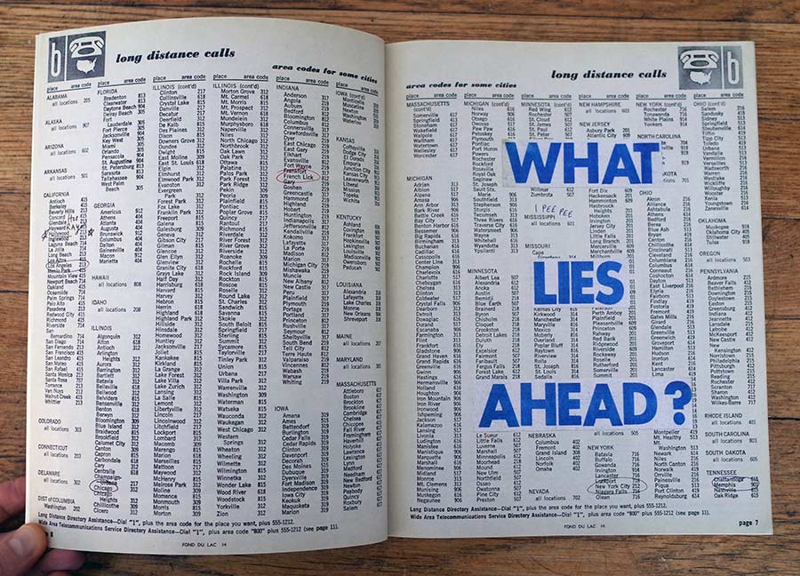
Another notable alteration early on in Bottom of the Lake includes blue words spread top-to-bottom: “WHAT LIES AHEAD?” This establishes a narrative/visual arc that over the course of the book reveals itself. A last example includes an excerpt from a tourism pamphlet, "The purpose of this booklet is to present an honest and clear picture of Fond du Lac and the delightfully prosperous section of Wisconsin in which it is located. It cannot contain all of the information everyone desires. Citizens, boys and girls, read it seriously.” Patterson's inclusion has layers of meaning: The idea that the book will introduce a portrait of Font du Lac, the fact that it is a subjective view, and the tongue-in-cheek manner which suggests Patterson's will be a critical reading.
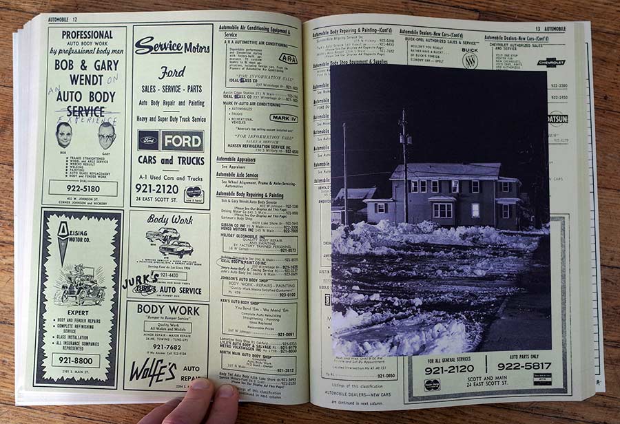
Throughout the rest of the book there are verbal puns, autobiographic additions, meta deconstructions, black and white photos, among numerous other literary devices. Together they can be interpreted and re-interpreted in a free-flowing manner over numerous, highly literary readings.
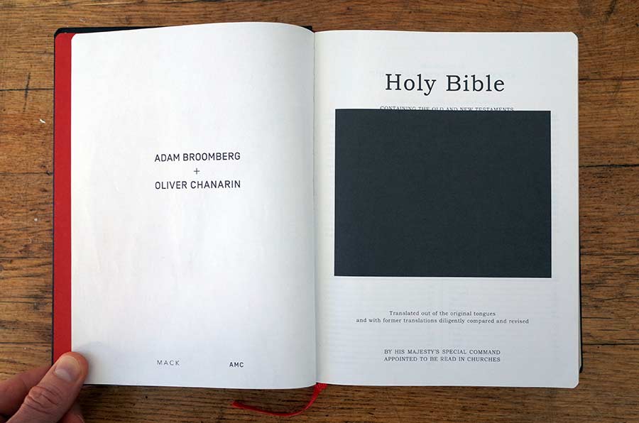
Adam Broomberg and Oliver Chanarin's Holy Bible transforms scripture into literature through a similar mode of altering the original text with images and the underlining of particular words. However, where Patterson applies humor, Holy Bible is dark and penetrating. There are 512 images of an incredibly diverse range from the Archive of Modern Conflict, London, together with Adi Ophir's concluding text Divine Violence.
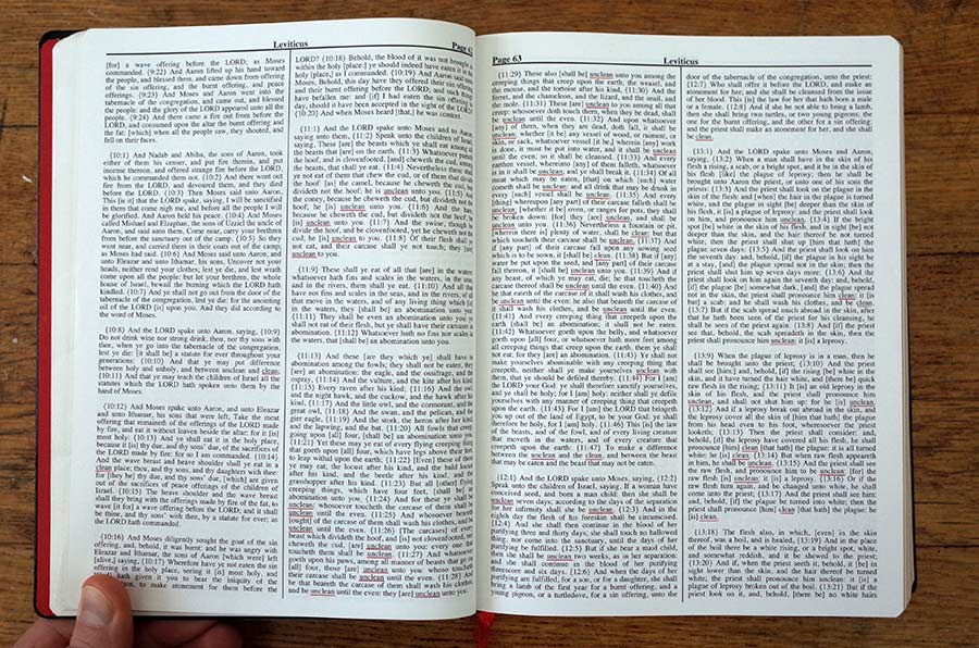
Textual alterations in Holy Bible are represented in a spread from Leviticus, where only the words "clean", "unclean", and "cleansing" are underlined in red, a total of 54 times, thereby pointing to the obsession with cleanliness and the dualism of the clean and the unclean. Pictorial alterations with text include a spread, where on the left side the red underlined text reads: "His own hands shall bring the offerings" and the overlaid image depicts two hands holding a spoon with a lighter underneath.
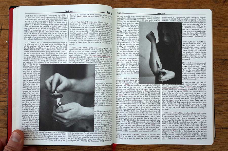
On the right-hand page, "blood" is underlined nine times, including the longer line "dipped his finger in the blood," which sits below an image of a figure shooting up intravenously. Together, these alterations meditate on the biblical notion of sacrifice, offerings, and the street experience thereof. Additional interpretations stem from the juxtaposition of the biblical with the real and reference to religion as the opiate of the masses.
Holy Bible unflinchingly questions our understanding of humanity's relation to violence as well as the relation the scriptural Bible has with violence. This work is very complex and my analysis does not pretend to be more than a look at the strategy these authors have taken to transform a scriptural text into literature through their artist book interventions.
In synthesis, these artist book makers have taken traditionally non-literary works, including the phone book and the Bible, and re-imagined them through the form of the artist book. In so doing, these artist books have effectively expanded literature to include non-literary forms.
[1] Jonathan Culler, Literary Theory, A Very Short Introduction (New York: Oxford University Press, 2000) 28.
Alexander Mouton has a background in film, literature, and photography. His artist books are self-published under the Unseen Press moniker, many of which are in collections internationally, including MoMA NYC and the Getty Research Institute, LA. Currently, Alexander is Associate Professor, Chair, Dep’t Art, Art History & Design, Seattle University.