For the past twenty years I have taught three courses: Color/Design Fundamentals, Photography, and Book Arts. One place where the concerns of the three courses meet is in designing page spreads for artist books. In my book arts courses, students often use the convention of the "full bleed" page layouts when using photographs in their books. I would like to explore the qualities of full-bleed images in book design, as it relates to the concept of "simultaneous contrast" and "color relativity.”
In my color/design courses, I posit that color is relative – always influenced by light and proximity to other colors. I stress that this relativity happens whether we want it to or not, so we should understand how it works. I base this study on the findings of a nineteenth century French chemist, Michel Eugene Chevreul, who published the book The Laws of Contrast of Colour: And Their Application to the Arts, in which he outlines the idea of "simultaneous contrast" in color interaction. Speaking about the juxtaposition of adjacent colors, contiguous on one edge, Chevruel writes, "now as these modifications cause the colours to appear, when looked at together, more different than they really are, I have given them the name of the simultaneous contrast of colours."[1]
Clarity of the color effects can be seen in the classic teaching studies of Josef Albers, who was influenced by Chevreul [2], by making studies in which 3 colors appear as two or three colors appear as four. In these simple arrangements, placing two full bleed color blocks adjacent to one another and adding one additional hue into both blocks will result in either an expansion or a reduction of the individual hues.


Digital color study examples by Jeff Nilan
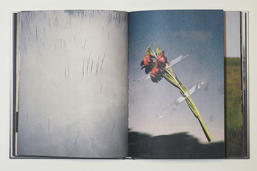
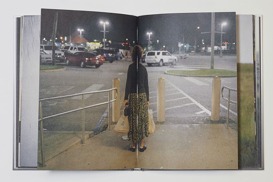
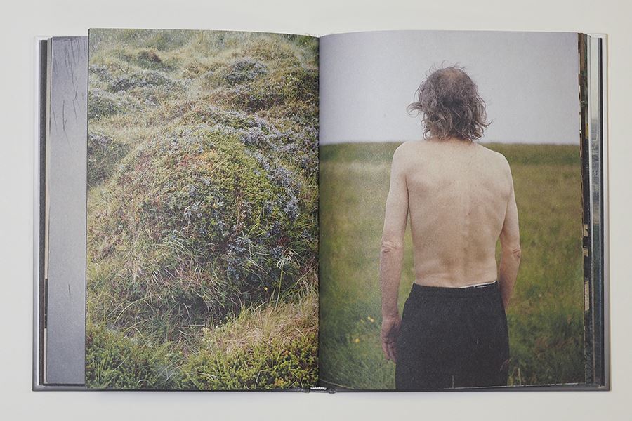
In my photography courses, we explore how images influence one another in a group, a series, and ultimately in a sequence. We come to see that the information in photographs, regardless of the color/tonal qualities, is also relative. Like color, images are influenced by proximity to other images. This subject matter seems especially pliant when images are placed flush against one another with a "contiguous edge." As this happens whether we intend it to or not, we should understand more about how it works. A book that I regularly show in all three of my courses, that combines the concept of simultaneous contrast with photographic imagery, is Some(W)here by Andres Gonzalez.
I stumbled upon Some(W)here years ago at Photo-Eye Books, when I randomly pulled the small cloudy grey casebound book off of the shelf because it had a blank spine. In fact, other than the title on the front and back covers and a minimal colophon, there is no text throughout the book. Opening the book, we are drawn into the sequence with a close up of landing gear on an airplane. What follows is a seeming travelog of images, both disparate in subject and related in tone, that are knitted together as full bleed page spreads with occasional partial pages.
Gonzalez, Andreas (2012). SOME(W)HERE. Amsterdam: MartSpruijt
Images in the book often transcend the gutter, sometimes pinched, with the main focal point of the photograph sinking into and out from the gutter. Images become layered when passages of partial pages interact with previous and those yet not arrived at, such as horizon line from a yet unseen landscape. Full width pages then become hints, fragments, place holders, that we can we hang on to for brief passages, before they disappear back into the text block.
Just as a brown rectangle in the Albers' study mentioned above surrounded by red and green cannot be seen as it is when surrounded by white, in Some(W)here, I would suggest, the images can never be viewed as individuals, uninformed and shaped by the others. They are, as full bleeds, a continuous vibration of subject matter.
[1] Chevruel, M.E. (1861, 3rd Edition). The Laws of Contrast of Colour: And Their Application to the Arts. London: Routledge, Warne, and Routledge. Link to the Getty Center Library PDF: https://ia803206.us.archive.org/20/items/lawsofcontrastof00chev/lawsofcontrastof00chev.pdf
[2] https://clarencewardartlibrary.tumblr.com/post/189845887016/color-theory-chevreul-albers
[3] Gonzalez, Andreas (2012). SOME(W)HERE. Amsterdam: MartSpruijt.
Jeff Nilan received an MFA from Indiana University in 1999. Growing up in Nebraska, Nilan’s art draws influence from the landscape and culture of the Midwest and he is interested in the ways art reflects and shapes the mythology of this region. Jeff resides in Delaware, Ohio and is Professor of Studio Art at Ohio Wesleyan University.