

|
|
Mervi Pakaste
BIO
Born and raised in Finland, Mervi Pakaste now works as an Associate Professor at Kansas State University in Manhattan, Kansas. Mrs. Pakaste earned her Bachelor’s Degree at the Edinboro University of Pennsylvania and her Master’s Degree from Penn State. In addition to professional design practice, Mrs. Pakaste works in Letterpress and Book Arts. Her work has been exhibited both nationally and internationally, and has appeared in publications such as HOW, Creative Quarterly, and GD USA.
ARTIST STATEMENT
My creative work centers on the exploration of typographic form and texture. As language made visible, the character of wood and metal press typography invites investigation of the abstracted sculptural qualities of written language. Working with letterpress and hand-setting type methods across various materials, has enabled a deeper exploration of what makes this format and methodology unique in an era of ubiquitous digital ephemera. It is in these hands-on processes, from semi-translucent and metallic ink layering, to alternative materials and laser-cut void forms, where my sensitivity to new formal ideas has emerged. I try to highlight “the character of the character” throughout my work, where the rhythms of a letter or a face are integral to each piece.
Through my work, I wish to offer people the opportunity for quiet exploration and discovery of typography as sculptural form and counter-form, aligned with its inherent possibilities for the abstract visual expression of language and its natural rhythms. My native language (Finnish) is considered highly rhythmic in both its syntax and its complex grammatical structures. Along with these natural rhythms, my work explores the tactile and historical assets of type, applied through a contemporary approach in form language. This juxtaposition of traditional and contemporary helps me create moments of dynamic visual tension and intrigue, allowing a unique physical presence to emerge with time through the material. A dialog emerges between the hand, the material, the ink, and the forms themselves; the shape of this work contrasts the nature of the pixel, trapped within the material context of the monitor. The same physicality mentioned above is also involved in setting type, operating a press, and sculpting a dimensional “book,” ultimately creating a physical bond between the work and the maker, which is then in turn, passed on to the viewer.
ARTWORK
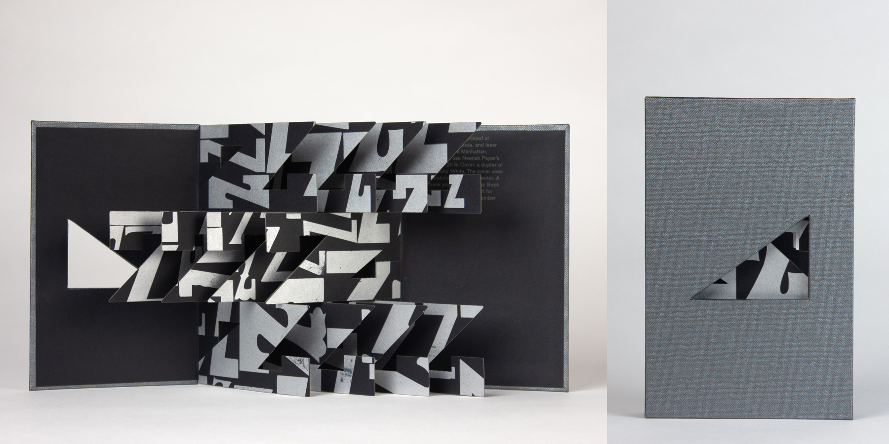
Title: Zebra
2023
Medium: Letterpress on paper, laser-cut, and handbound
Size: 4.5 x 7 inches
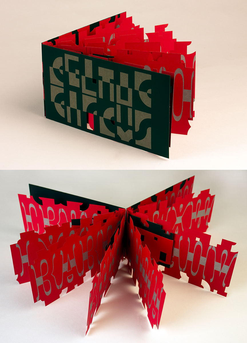
Title: Celtic Circus
2020
Medium: Letterpress on paper, laser-cut, and handbound
Size: 4.5 x 8.25 x 0.5 inches
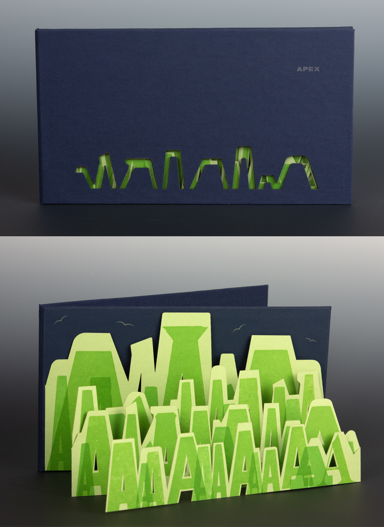
Title: Apex
2022
Medium: Letterpress on paper, laser-cut, and handbound
Size: 10.25 x 5.5 inches
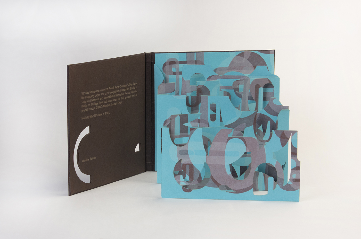
Title: O
2021
Medium: Letterpress on paper, laser-cut, and handbound
Size: 5.5 x 5.75 inches

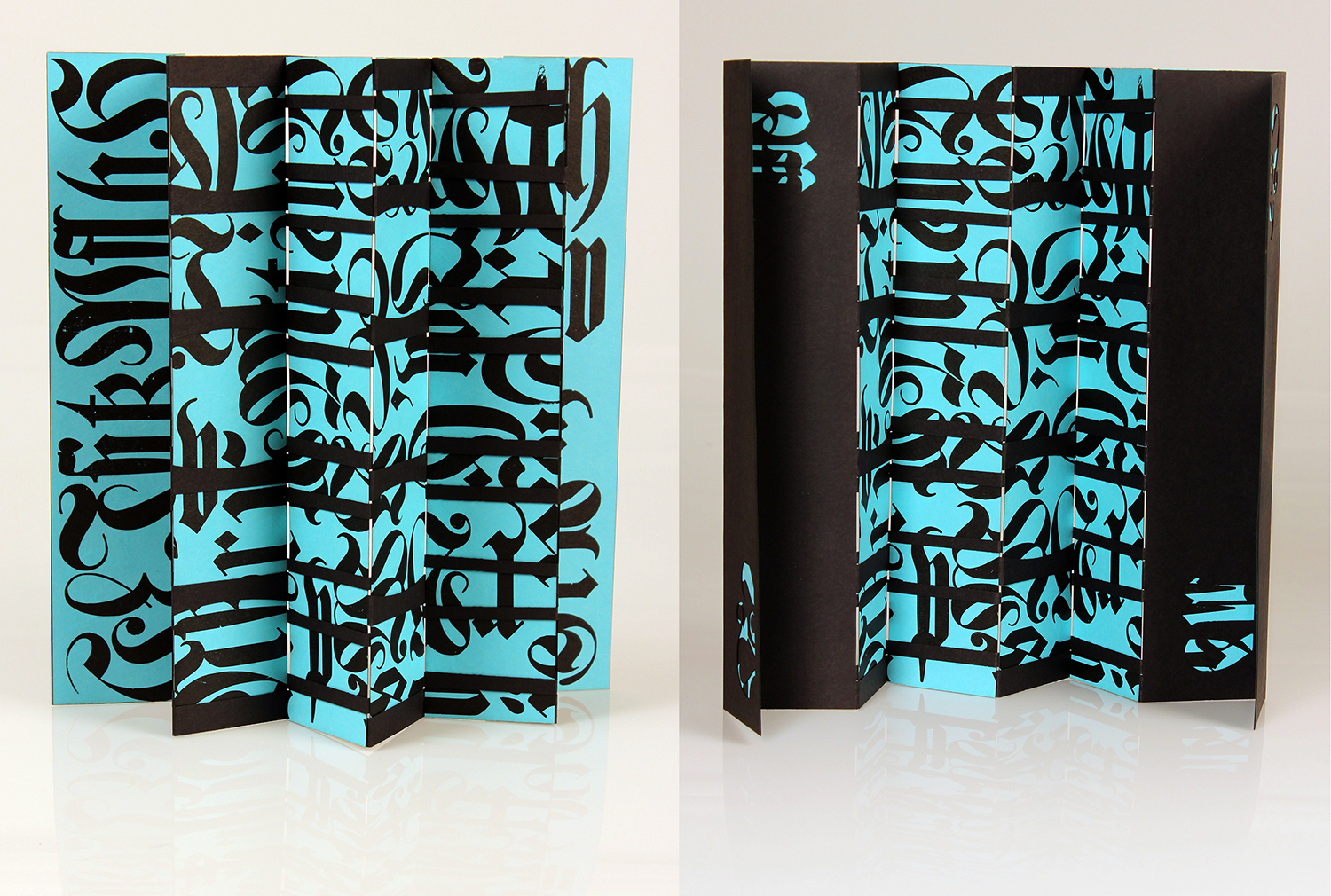
Title: Hive
2023
Medium: Letterpress on paper, laser-cut, and handbound
Size: 3 x 12.5 inches
Title: Blackletter Body
2017
Medium: Letterpress on paper, laser-cut, and handbound
Size: 11 x 2.25 inches
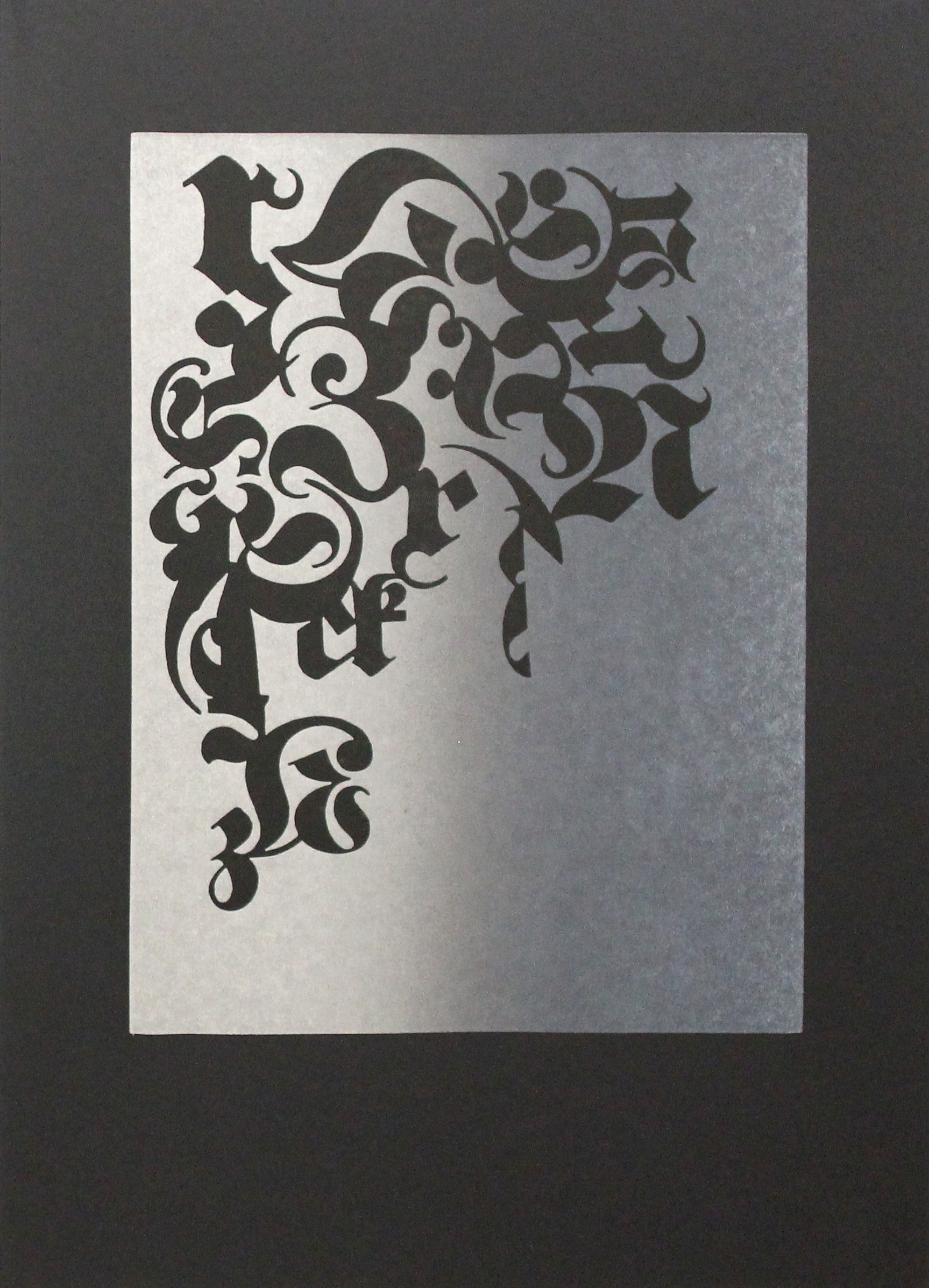
Title: Blackletter Harmony N°1
2017
Medium: Letterpress
Size: 17.5 x 12.5 inches
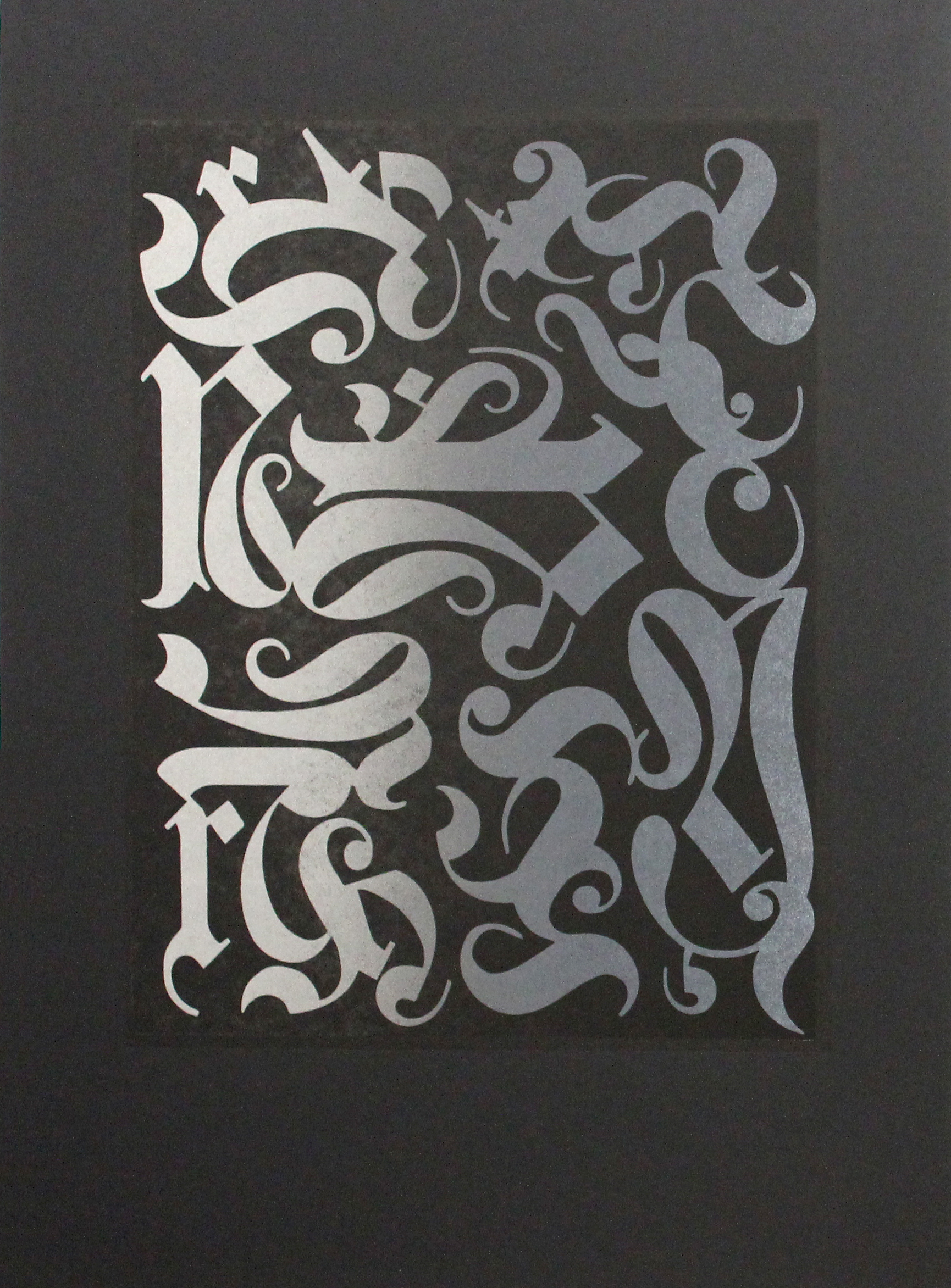
Title: Blackletter Harmony N°2
2017
Medium: Letterpress
Size: 17.5 x 12.5 inches
|


