

|
|
Are you a CBAA member and interested in being considered for our featured artist section? Email a link to your website or 3 images of your work to artistofthemonth@collegebookart.org. We will contact you with more information.
Craig Jobson
Lark Sparrow Press
Website: LarkSparrowPress.com
BIOGRAPHY
 My design career and, specifically, my Book Arts design career did not start with my University of Texas BA in English Literature or my BFA in Art. It started during my job as a part-time county hospital technician in Austin, Texas performing CPR (Cardiopulminary Resuscitation) nearly 40 times in the years it took me to finish my two degrees. My departmental manager knew my habit of making sketches and had me draw up schematics as part of in-service instruction sessions. By the time I reached my first significant job interview at the National Office of the American Heart Association in Dallas, Texas, they valued those six years of CPR experience as much as my award winning portfolio and cash award for painting. As their Art Director, I participated in national public health programs and won regional Addy awards for an advertising campaign and anti-smoking program. However, after four years of socially-conscious design work that I really enjoyed, I decided my future did not lie in producing every single design project in PMS 485 Red and Black.
My advertising work won the attention of and a job offer from the Dallas office of BBDO advertising. I was one of six team members who worked on the $40 million Frito-Lay tortilla chip account. I art directed TV spots, designed a Clio winning probono poster for the Dallas Symphony Orchestra, and won national Addys touting my haberdasher ads. My art direction landed a $1 million office products account with Xerox. But after four years I no longer saw my future in making the world safe for starched linen collars and snack chips. At that time in my career, I had never heard the term “Book Arts.”
I wanted to resume work on quality of life issues rather than focusing on mass consumption and I found it in my next position as Senior Art Director in publishing for a division of Harcourt Brace in Austin. My advertising background played a significant role as I directed a staff of 14 designers working on cover designs for literature and history books. It was exhilarating. It was a position I thought I would work in for the rest of my career – until the publishing buy out wars began and I left the trenches before becoming a casualty.
My future was on hold until I was offered a position at McDougal Littel as Design Director and moved from Austin, Texas to the Chicago area. They had big budgets for unbelievably large, complicated design projects in writing and literature. The design department won publishing awards during that period, but what I remember most was chairing the 1993 44th Annual Chicago Book Clinic Awards Show. Held at Chicago’s Shedd Aquarium, it was produced by me and 26 of my colleagues. With 425 submissions, for the show, it was the largest book show ever mounted by the organization. There were 675+ attendees, despite anti-Buluga Whale protests at the Shedd. That year the Clinic initiated a new book category – limited editions, letterpress books, and artist books. Those five submissions were my first experience with Book Arts.
Publishing and education has defined most of my professional career. When a design faculty position opened at Columbia College Chicago I knew I had to apply. I was chosen and assigned to teach Publication Design and the History of Typography. While teaching full time, I realized I wanted to publish books on my own. I completed an MFA in the school’s Book and Paper program. As I became more accomplished in my graduate program so did the students in my Publishing and History of Typography classes. In my 17 years of teaching, I mentored my publishing class through 15 years of double-issue experimental magazines and 230, small, bound-up abecedariums. The History class students designed and published over 800, individual, 80-page, 11” x 17” perfect bound and cased in typography history books. Several students won regional and national book awards for their efforts. In 2013, I presented a paper at the CBAA’s annual meeting at Mills College titled ”The Book Arts and Teaching the History of Typography,” based on those classes.
In 2001, after receiving my MFA, I bought a Vandercook IV and opened Lark Sparrow Press. In 2014, I retired from 17 years of teaching to pursue publishing handmade books. Since 2001, I have published 21 different titles. All the books have significant literary text. All but three required handset typography, one book containing over 200,000 pieces of type. All but three are hand bound, signed and editioned. Four books are abecedariums. Two contain 26 original postage stamps. Five are artist books. Eight have my illustrations and were written by me. Three were collaborations with other writers. Two have illustrations by former students. Two have hand made paper by a former Book and Paper grad. One is illustrated by the United States Office of Patents and Trademarks. And one, a 72-page book, was printed in three colors and was editioned to 100 copies. It required over 27,000 hand pulled impressions. Today I continue work on yet another 72-page book. It will have seven short stories, seven embossed images, seven illustrations, and an engraved bamboo cover. Ironically, the book, titled Fortune Cookies, is being printed in PMS 485 Red and Black.
ARTIST STATEMENT
Contemporary fiction, excellent design, and exceptional craftsmanship are the hallmarks of Lark Sparrow Press. My appreciation of those three interdisciplinary endeavors has defined the body of work at my press since its inception. Illustrated short stories are the platform where I explore these three efforts. A short story is like a small window that we, as readers, can peer into to see a brief intimate view of someone else’s life—their habits, desires, interests. Inside that window we might also discover a mirror that reflects back our own lives and how they might be so much more than we ever expected.
I begin a new book by discussing the origins and intent of a manuscript with the writer. The word is always primary in Lark Sparrow books – what it says, what it means, how it looks on the page. We discuss the different stages of the story, the development of character and plot, the economy of words, and the inevitable change of direction as we near the story’s end. Having identified those features I explore different visual solutions compatible and supportive of the story and the author’s intent. Once those tasks have been throughly explored, I begin the process of producing a book formerly existing only as an idea between two people. My aspiration is to craft a paper sanctuary for the story, a place that recognizes its beauty, dignity, and power. I want each story that I print to be a precious, forceful memory for each reader made of ink on paper. My tools are design, meticulously handset typography, exceptional illustration, patient letterpress printing, archival paper, hand binding and elegant casing that attests to the excellence of each story.
ARTIST'S WQRK
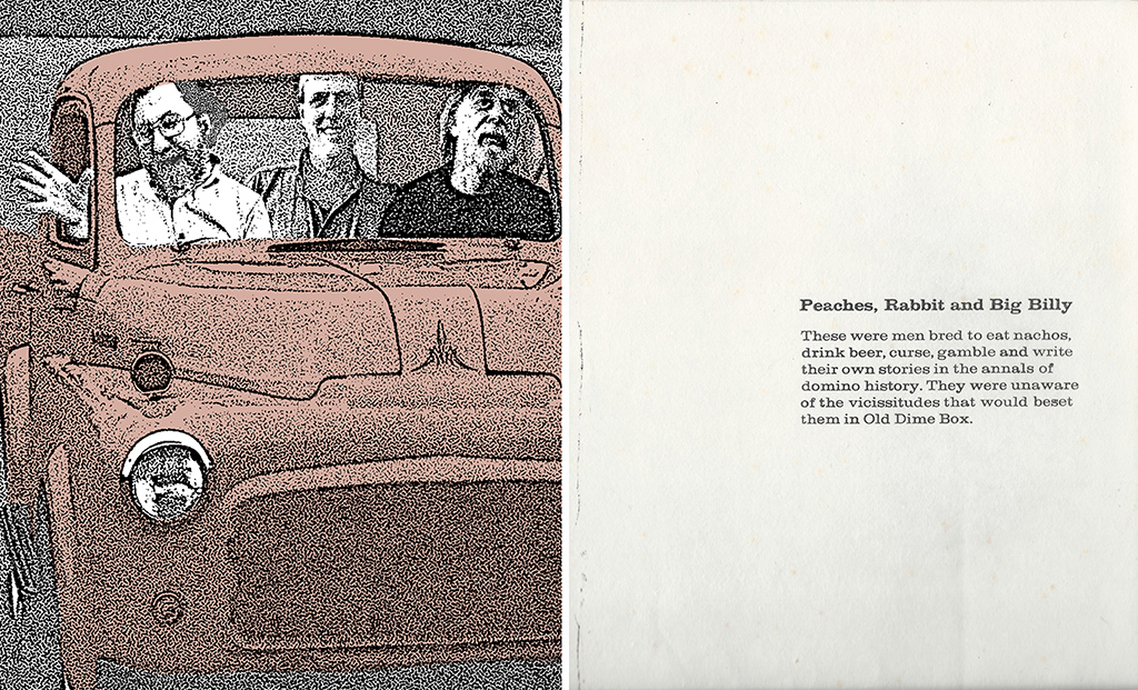
Title: The Billy Chronicles Part III : The Colonel’s Chicanery “Guys,” written and illustrated by Craig Jobson
Size: 6.75 “ wide, 9.0” tall, 20 pp. 14 pt. Clarendon, 15-copy edition
Media: 2-color concertina , illustrated, letterpress printed on handmade abaca paper. Includes a set of tournament dominoes.
Note: This spread is from the third domino book in The Billy Chronicle Trilogy. Here Peaches, Rabbit and Big Billy, are on a road trip to Old Dime Box, Texas and a big domino game.
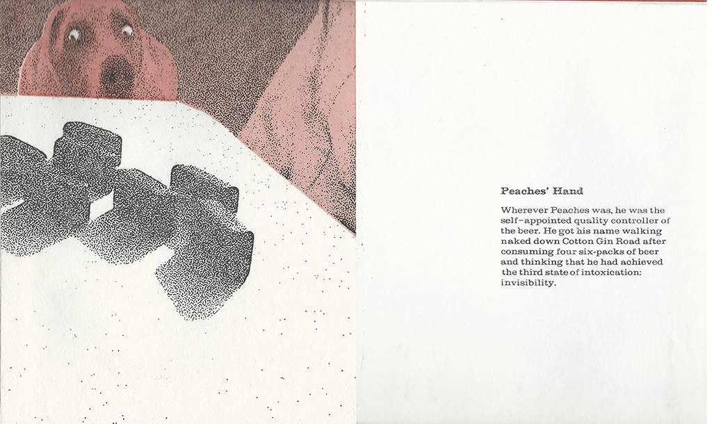
Title: The Billy Chronicles Part III : The Colonel’s Chicanery “Peaches” written and illustrated by Craig Jobson
Size: 6.75 “ wide, 9.0” tall, 20 pp., 3 titles, 15 copies each
Media: 2-color concertina , illustrated, letterpress printed on handmade abaca paper. Includes a set of tournament dominoes.
Note: The Billy Chronicle Trilogy, is about true facts, guile, treachery, revenge and dominoes. Here a bird-dog surreptitiously aides the winner of a high stakes domino match.
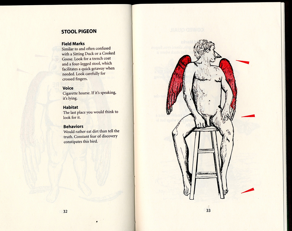
Title: Field Guide to Urban Fowl “Stool Pigeon” by Craig Jobson
Size: 5.75 “ wide, 8.75” tall, 65 pp., editioned to 100 copies
Media: 3-color spreads, hand printed letterpress pages on Wausau Exact 70# paper with 11 pt. Minion and a flat back binding
Note: This abecedarium is a spoof of birding field guides. It uses satiric bird-like figures to lampoon social, political, athletic, and cultural types. Illustrated by Mike Lesniak
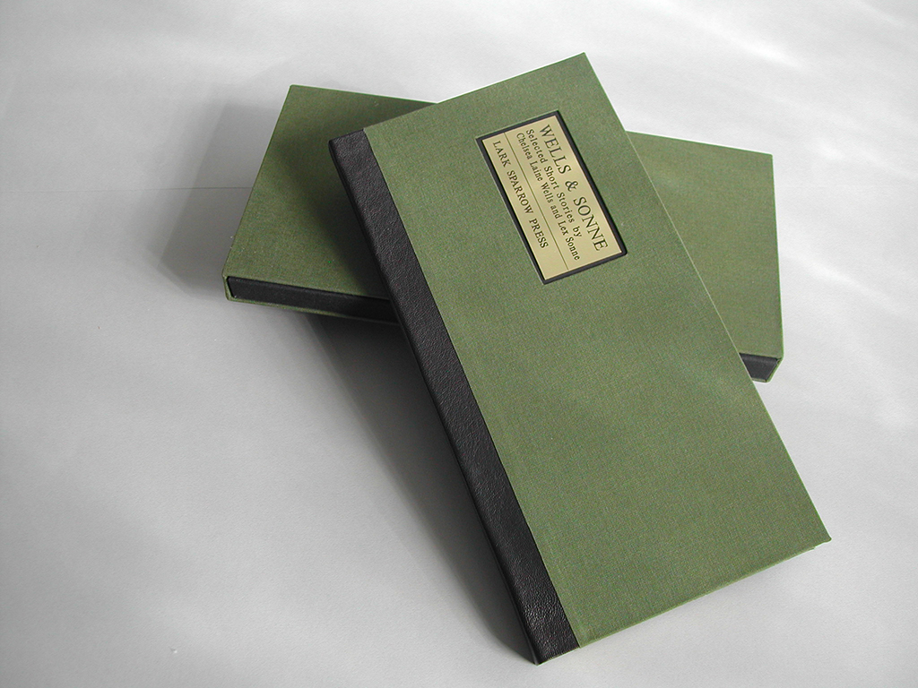
Title: WELLS & SONNE: Selected Short Stories by Chelsea Laine Wells and Lex Sonne – Book with slip case
Size: 5.50“ wide, 11.0” tall, 72 pp., editioned to 70 copies
Media: hand tinted illustrations, hand printed letterpress pages on Gutenberg #130 paper using 12 pt. Chelteham, sewn on board binding and matching slip case.
Note: Six illustrated, contemporary short stories are printed with 220,000 movable pieces of type.
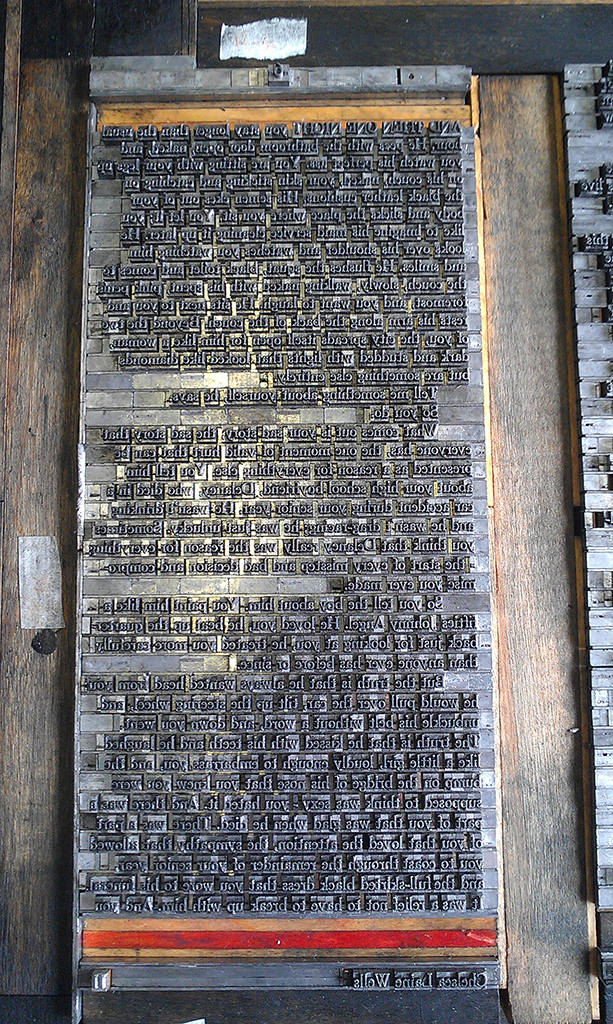
Title: WELLS & SONNE: Selected Short Stories by Chelsea Laine Wells and Lex Sonne – page 11 locked up in a chase
Size: 5.50 “ wide, 11.0” tall, 72 pp., editioned to 70 copies
Media: hand tinted, illustrations, hand printed letterpress pages on Gutenberg #130 paper with sewn on board binding
Note: Make ready for printing each page used over 2,100 pieces of 12 pt. Cheltenham and Cheltenham italic per page.
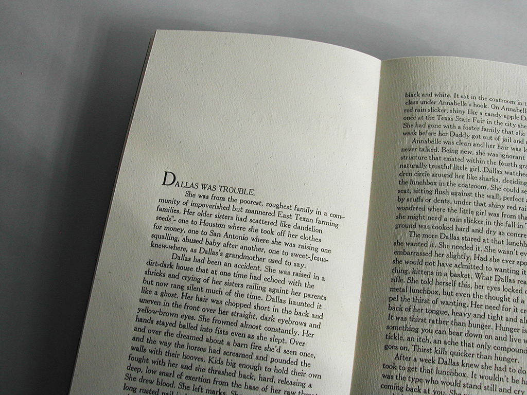
Title: WELLS & SONNE: Selected Short Stories by Chelsea Laine Wells and Lex Sonne – opening page
Size: 5.50 “ wide, 11.0” tall, 72 pp., editioned to 70 copies
Media: hand tinted, illustrations, hand printed letterpress pages on Gutenberg #130 paper with sewn on board binding
Note: The opening spread from the Pushcart nominated short story by Chelsea Laine Wells –” The Hand of God.”
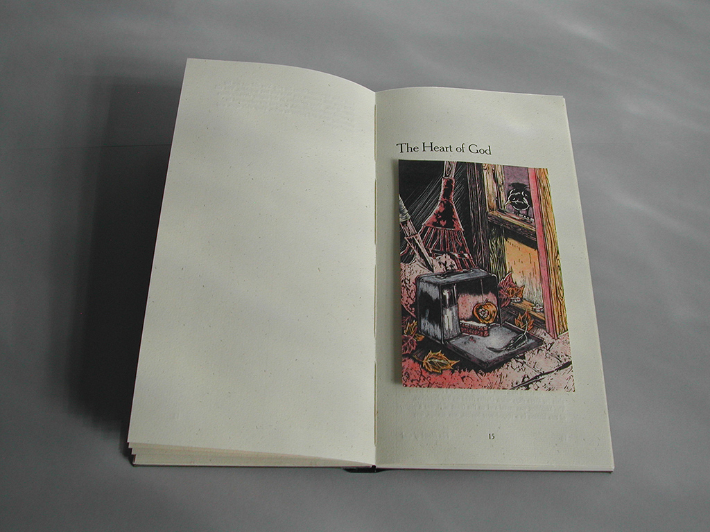
Title: WELLS & SONNE: Selected Short Stories by Chelsea Laine Wells and Lex Sonne
Size: 5.50“ wide, 11.0” tall, 72 pp., editioned to 70 copies
Media: hand tinted, illustrations, hand printed letterpress pages on Gutenberg #130 paper with sewn on board binding
Note: One of six original illustrations by Derek Goodman. Base image printed black on Kitakata, then hand tinted and tipped in.
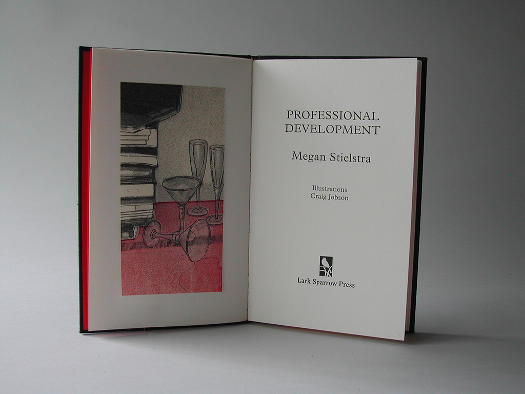
Title: Professional Development by Megan Stielstra – title page with 2-color illustration
Size: 6.125“ wide, 10.0” tall, 24pp., editioned to 30 copies
Media: 2-color, illustrated, letterpress printed, on 250 gm. Stonehedge Cream with 12 pt. Plantin, flat back binding.
Note: Frontice and title page, illustration by Craig Jobson
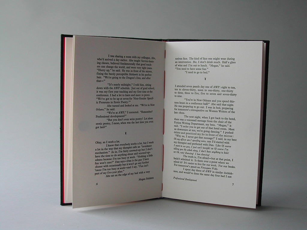
Title: Professional Development by Megan Stielstra – two page spread with red binding
Size: 6.125“ wide, 10.0” tall, 24pp., editioned to 30 copies
Media: 2-color, illustrated, letterpress printed, on 250 gm. Stonehedge Cream with 12 pt. Plantin, flat back binding.
Note: Story takes place in at an academic conference in New Orleans. A proper writing professor is swayed from business all the time to fun all the time.

Title: Professional Development by Megan Stielstra – 2-color tripart illustration by Craig Jobson
Size: illustration 17.0“ wide, 9.5” tall
Media: 2-color, illustrated, letterpress printed, on 250 gm. Stonehedge Cream with 12 pt. Plantin, flat back binding.
Note: A writing professor is swayed from business all the time to fun all the time at a New Orleans conference and is inexplicably followed by a marching band. Fold out illustration.
|


