In this follow up post to Let it Bleed, part one, I will explore further the relationship between basic color interaction theory and the ways that full bleed photographs influence one another. I will compare three artist books – two made by former students from my Book Arts classes – along with one of mine that I have used in classes as a teaching tool for the past few semesters.
The first book, The Nature of Us by Ashley Swindell, is a case bound book with full-bleed images and flyout pages throughout. This combination allows for the flyouts to be pulled out to interact with a page spread or tucked back away at any time. The photographs in her book depict the transition from previously rural small-town Ohio into a more suburban new housing development reality. The images in the book layer upon one another; past, present, and future are inextricably linked both in binding and in image interactions. As there is no space between the images, they are always seen in relation to one another. Flyouts at times appear as details of faraway elements in the photographs. Other times they extend the image outside of the standard book length, and when left out they inform the subsequent images. This relates to the subject matter of The Nature of Us in that it embeds and expands the dialogue between loss of the rural and replacement with the suburban; we cannot see one without consideration of the other.
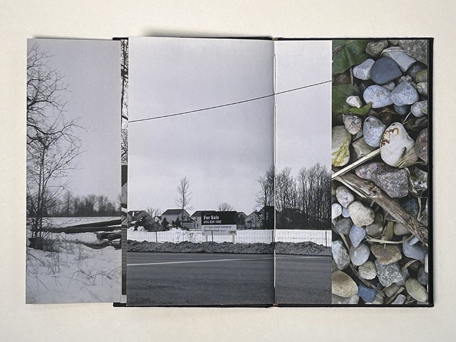
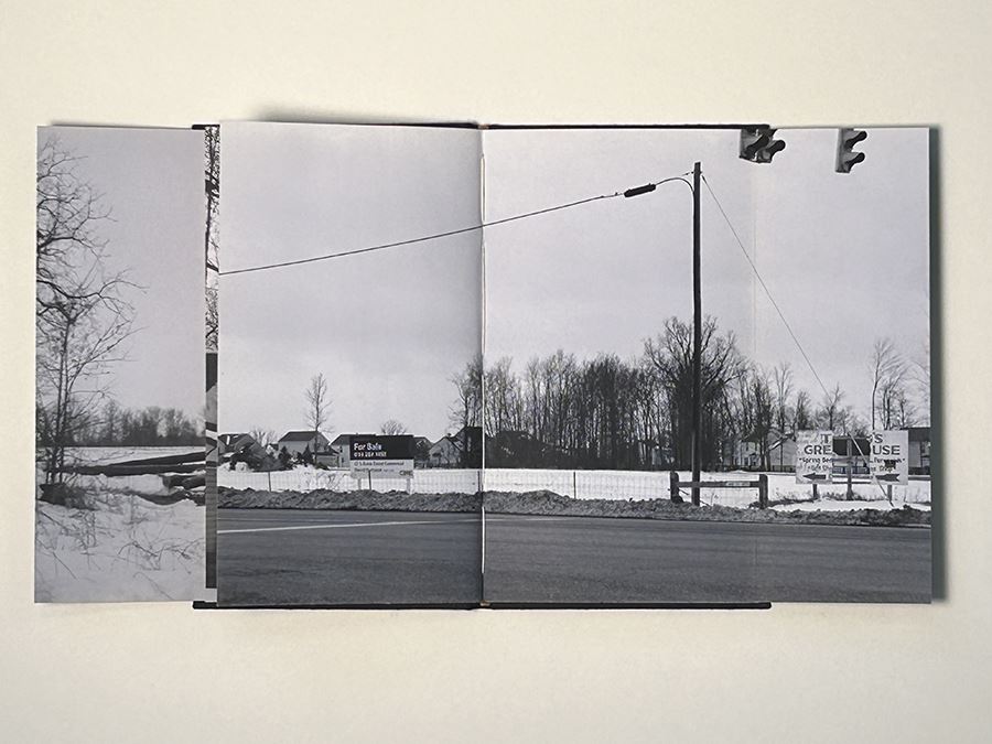

The Nature of Us, consecutive page spreads, case bound book, Ashley Swindell
The second book, Home by Maggie Myers, is a “cased-in” accordion binding with occasional “half-pages,” and the page spreads throughout the book are full bleed photographs. In Home, Myers is conflating photographs taken in her childhood home with photographs taken in her college apartment. The photographs are close ups of walls and surfaces. Light and shadows move through the accordion pages, with the binding knitting together the two separate spaces. Diagonal rays of light seem to transcend the edges of the individual images, resulting in a sort of panoramic viewing of one single space. In this, a comparison can be made to the study showing three colors appearing as two (see color study example in part one) in that images of like subject matter/formal relationships can reduce down, such as three images becoming more like two.

Home, accordion binding, Maggie Myers
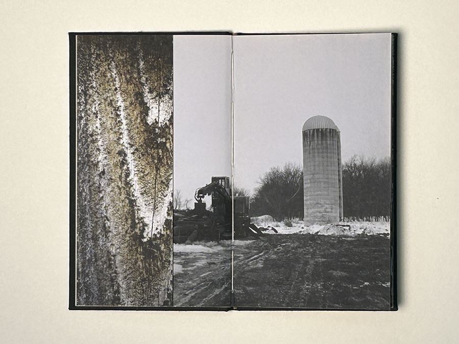
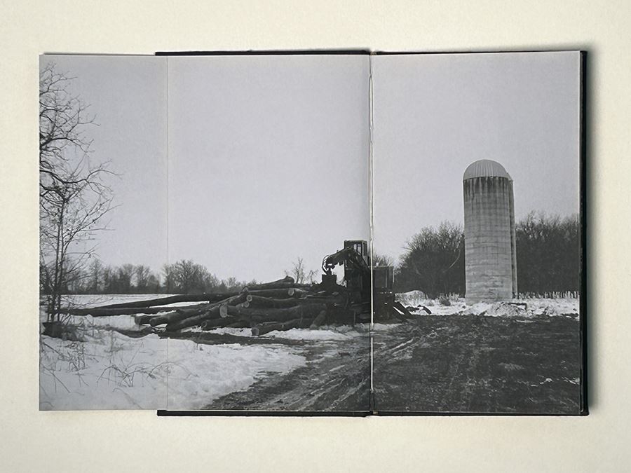
The third book, Ground by Jeff Nilan, was initially constructed as a “board book” with full-bleed photographs and one “flyout” page spread. I have always been fond of this book – the photographs and their sequential order – but to me it has never felt like it was settled or comfortable in its binding. Over the past few semesters, I have used this book as a teaching tool by redesigning the layout and binding style while keeping the original nineteen photographs in their original order. With this, I can begin to talk to my students about image/layout /binding relationships through a direct comparison of the same content. The images below show the same page spread as presented in three different binding types: an accordion binding, a Japanese four-hole binding, and the most recent iteration, a traditional case bound book. The case bound iteration is the first to include space between the images, along with removing the potential for altering the sequence as is possible in the accordion version.
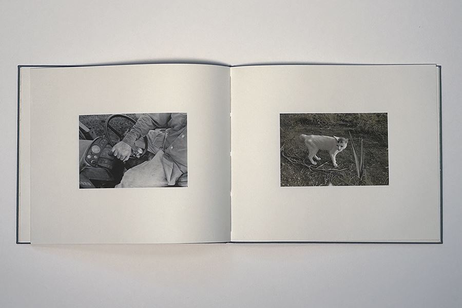
Ground, case bound page spread, Jeff Nilan
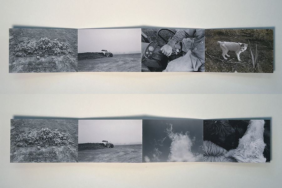
Ground, accordion page spread, Jeff Nilan
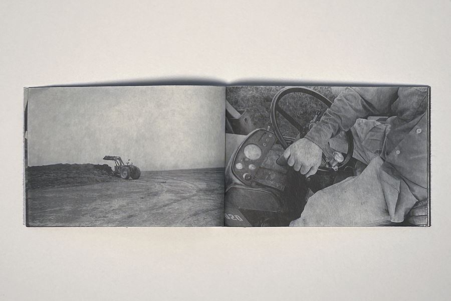
Ground, Japanese binding page spread, Jeff Nilan
Relating the image interactions of these three books to our discussion around color relativity, flyout full-bleed images, and accordion image progressions is like adding additional background colors to the Albers style color studies. In the color study example below, we see that the turquoise strip on the bottom is the same as the strip and individual bars within each of the four backgrounds. There are five distinct color files being used for the study. However, due to the color subtraction and simultaneous contrast effects, we get the appearance of nine hues – 5 distinct colors interact to appear as 9 hues. The turquoise hue is changed in varying degrees of value, intensity, and hue, depending upon which background it interacts with. The turquoise then is a constant, but an inconsistent one; it is unable, when submersed into the full bleed background colors, to show itself for what it is on its own. The turquoise is always seen and interpreted in relation to the background color. Colors influence one another and so, too, images influence one another, especially when the images are flush against one another on at least one contiguous edge.
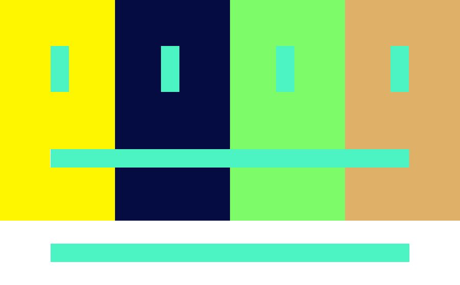
5 hues appear as 9, digital color study, Jeff Nilan
Jeff Nilan received an MFA from Indiana University in 1999. Growing up in Nebraska, Nilan’s art draws influence from the landscape and culture of the Midwest and he is interested in the ways art reflects and shapes the mythology of this region. Jeff resides in Delaware, Ohio and is Professor of Studio Art at Ohio Wesleyan University.