In July of 2023, Levi Sherman and David Solo sat down over Zoom to talk about some of their goals and issues they’ve encountered in running platforms for artist book criticism and reviews.
Levi is the founder and editor of Artists’ Book Reviews (ABR) (https://artistsbookreviews.com/), a website for reviews and interviews. David is a co-founder and co-editor of Book Art Review (BAR), a criticism initiative founded at Center for Book Arts in 2020 by Megan N. Liberty, Corina Reynolds, and David Solo. BAR is both a print and online (at https://centerforbookarts.org/bar ) publication.
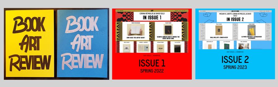
The first 2 issues of BAR were published in Spring 2022 and Spring 2023.
What are ABR and BAR trying to achieve and for whom?
DS: For BAR, the main goal has been to provide a platform for criticism and discourse about the artist book and that engages with the book as an object. Why and how does it work as a book as distinct from an exhibition on the wall or as a catalog of works? We don’t believe there is a right or wrong approach but rather that there are and should be a wide range of perspectives and the writing should express clear opinions supported by specific points.
LS: I try to write about things in a way that contributes to artist book discourse. Often the book does most of that work for me, but I might stretch more to write about a zine or pamphlet in a productive way for an artist book audience.
DS: We’re looking to reach both the existing artist book audience and also to expand it. One approach has been to look at how we can draw from the criticism of other artforms. Regardless of their background, people seem very comfortable criticizing a movie and the different components (script, casting, sound, etc.) that go into making a film. There can also be analogies with music criticism and the way an album is put together — looking at both sequencing and individual songs. It would be great to bring that same dynamic to artist books. It can be fun; it doesn’t always have to be serious.
LS: Film, music, and literature can all assume mass audiences. With a few exceptions, we can’t assume that another interested person has read a particular artist book or even has access to it. Exhibition reviews are a common solution for art writing in general, but exhibitions don’t offer a representative sample of the artist book field. I have noticed more platforms publishing artist profiles, interviews and collection spotlights, but these are not geared toward interpreting or evaluating art works.
DS: Regarding mass audiences, if you can’t assume that your reader will be able to access the book, how does it shape a review? For writers, editors, and people running platforms, what does it take to make a review meaningful in those circumstances? The selection of images to include (or links) becomes especially important in these cases and can influence what gets reviewed.
LS: I review what I receive, so there is a feedback loop between my readers and the books I review. Interesting micro-trends emerge: a review of a Portuguese book elicits more submissions from Portugal, or a review of asemic poetry taps into that world. Now that ABR has a few other reviewers, they can pursue their areas of interest and expertise. As editor, I help them connect with the broader book art audience.
As the pandemic recedes, I have also been asking how criticism can build community. I recently used the ABRcollection for a few lectures and events, and it felt great to put people in direct contact with the books.
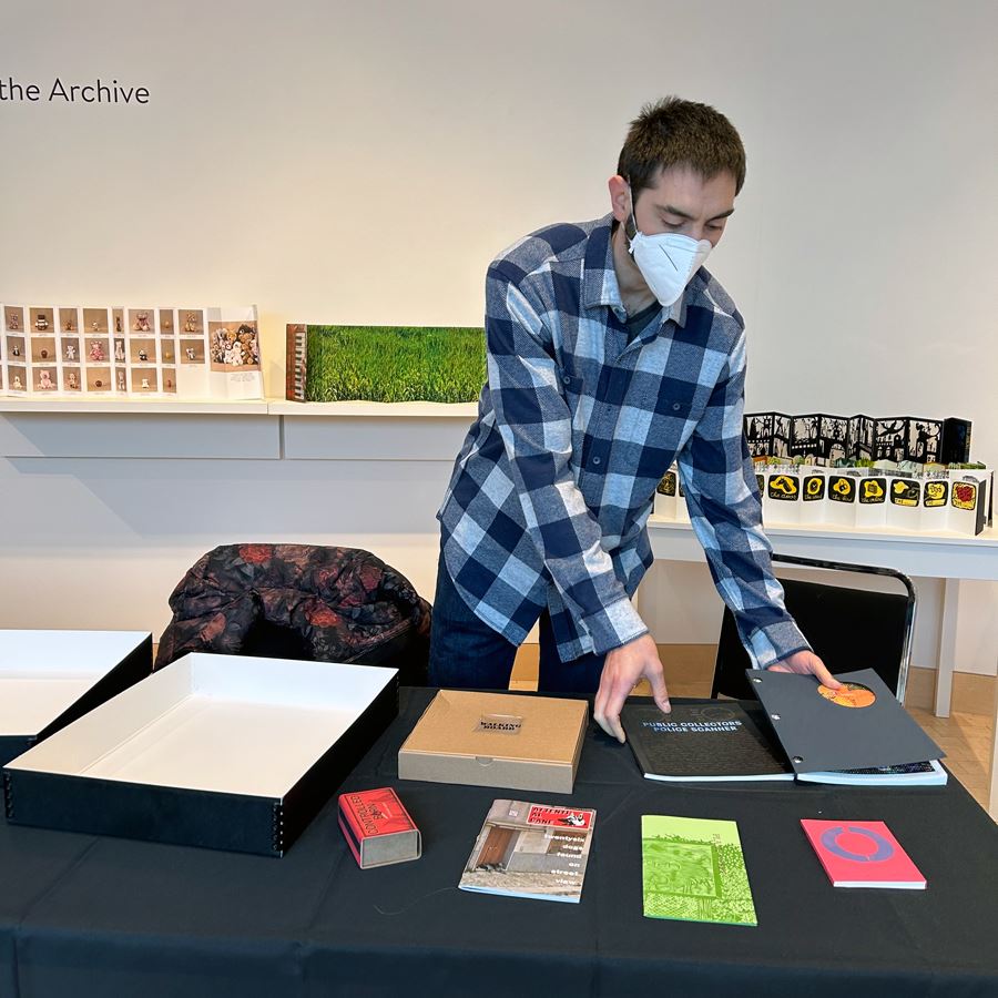
Levi Sherman setting out books from the ABR collection for a show and tell event at the James Watrous Gallery in Madison, WI. Levi appeared with Kayla Bauer and Stephen Perkins to discuss collecting and curating in conjunction with Stephen’s exhibition, Stephen Perkins: Mining the Archive.
DS: BAR is also experimenting with various components and collaboration — through conferences, workshops, visits and working with organizations. That includes the collaborative production of Issue 2 with Appalachian State, launch parties, happy hours/salons, etc. We also hope such events will help attract writers as well as readers and those who want to participate in the conversation and build the community.
We have found that finding and attracting writers interested in long form critical writing is a major challenge (not only for artist books, it seems) and so are working on partnerships, resources and other activities to help support aspiring writers from a range of backgrounds.
How does book art criticism intersect with book art theory? What questions should it ask and answer? What factors should it consider?
DS: The “type” of artist book — and its context — can play a role in the way it’s reviewed. I might assess, and write about, a piece with a small budget intended as an experiment or immediate response to a current event differently from the way I would approach a deluxe livre d’artiste or book developed over many years. I’m not sure that counts as theory, but we wrestle with the question of how much we talk about context. Many artist books and zines are created to address social and political issues, whether rapidly or over a long period of time, so to what extent should the criticism consider the intent? Context feels even more important for historical works although the reviewer might have to speculate more about the context of a work produced 50 years ago.
LS: It makes sense to consider artists’ intent and their position within the overlapping practices that constitute the book art field. I take reception theory seriously (as do good artist books that leave room for interpretation), but artists today are highly professionalized and often explicitly articulate their goals. We can reject an artist’s claims, but they still offer useful context.
DS: A lot of the work I’m personally interested in is collaborative, especially between image-makers and writers, and I do find it interesting and helpful to understand how the collaboration worked, which might not be readily apparent. Drawing on paratextual material, which may be more process than intent, can also be useful. A review that draws on background information is fine, and so is one that says, “I picked up this book and here is my response.” A good editor should help the reviewer decide about including such information and what they can expect their audience to know and in ensuring the sources of such information are acknowledged.
LS: I want reviewers to consider what their readers might think, but I also want them to share how they personally responded to a work. I find myself deleting a lot of passive language, even from good writers. I started out trying to be comprehensive and objective, both of which are boring and impossible.
In some ways, ABRmight be art appreciation rather than criticism. That doesn’t mean I won’t mention an aspect of a book that falls short, but in general my goal is to help people understand and appreciate artist books. I find people rarely need help finding flaws or disliking things.
Mediocre books often fail in the same ways, so another format might be better than piling onto a single work in a review.
DS: One approach would be more of an essay looking at individual trends and evaluating and describing when it works and when it doesn’t with specific examples.
LS: Perhaps a book that was bad in a unique or novel way could make for an interesting review.
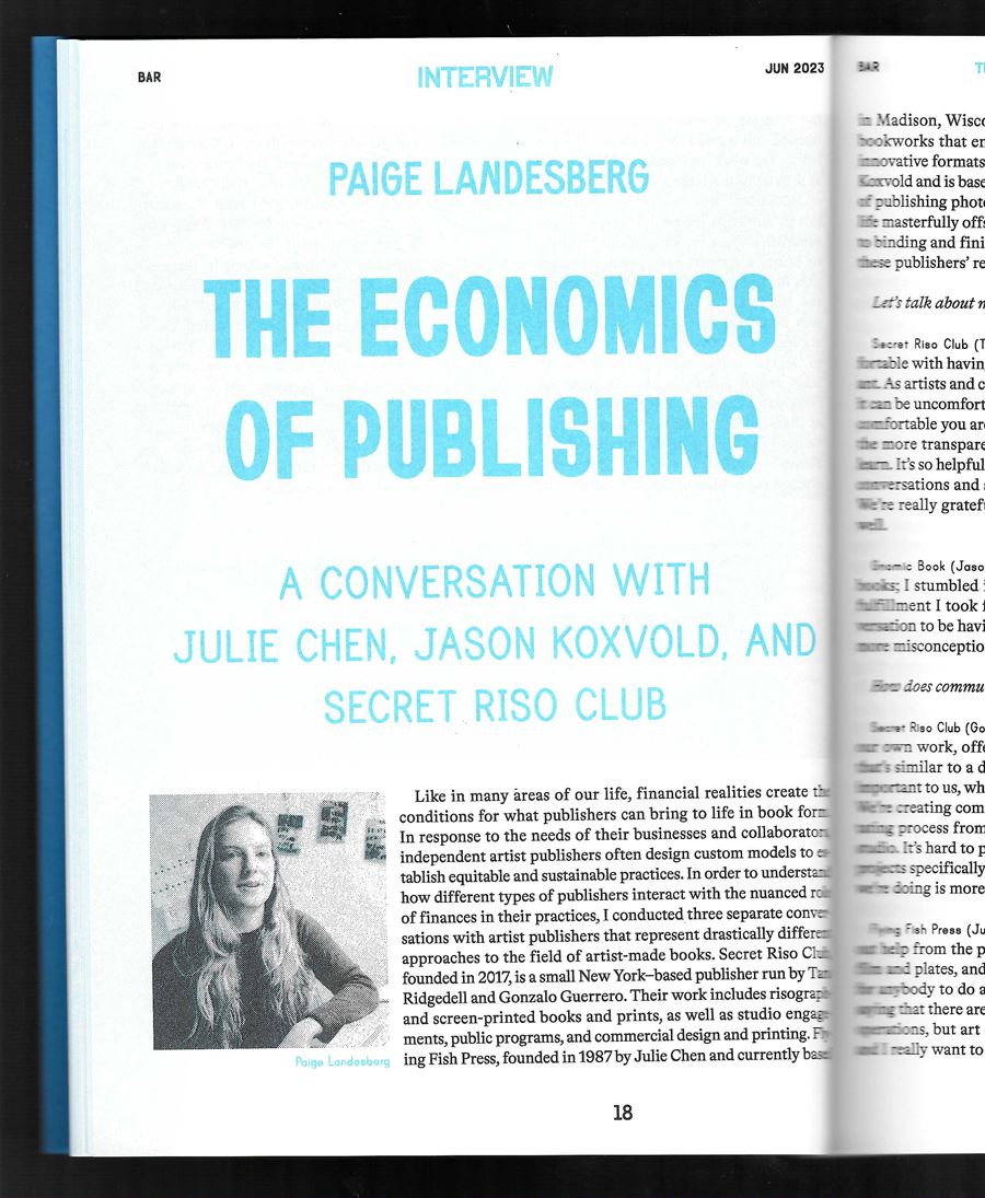
BAR Issue 2 article on “The Economics of Publishing.”
DS: Part of our larger objective is to foster wider accessibility for artist books and make the elements that go into a book more visible. That might involve discussing individual decisions — “did it need that insert?” or “perhaps it could have used one more edit” — in an otherwise positive review. Not that the decision is right or wrong, but making clear the reviewer’s reaction to the book and why. Sometimes these decisions are consequences of the tradeoffs that take place during the process of designing and publishing a book and in the most recent issue of BAR, we’ve also tried to shine more of a light on that, looking at the economic and other constraints associated with producing and distributing a book. This approach relates as well to our multiple audiences — both pointing readers to books that are interesting but also providing feedback to artists and publishers.