Recién estuve en CDMX. Mientras ahí pude ver varias cosas que he anhelado ver por mucho tiempo, incluso el Azteca/Mexica Piedra del sol y la Coatlicue monumental, Cabezas colosales Olmecas, el Castillo de Chapultepec, y murales de los tres grandes del muralismo mexicano, Orozco, Siquieros, y Rivera, el campus de la Universidad Nacional Autónoma de México (UNAM), y el Ballet Folklórico de México en el Palacio de Bellas Artes. Fue impresionante ver y considerar toda la historia posible que comparten y contienen estos restos y espectáculos en esta ciudad que presenta una cultura cosmopolita y tan universal como única.
Hay una frase en un libro religioso que leí que dijo que todo lo que estaba escrito en tal libro representaba solo una pequeña medida de todo el conocimiento concerniente a ellos, para que sus descendientes sepan algo que tiene que ver con sus antepasados. De todo lo que sabemos del pasado, ni una centésima parte entendemos de todo lo que ocurrió en culturas y pueblos anteriores. Así es como me sentí al contemplar lo que sabemos y no sabemos de la historia de México que está escrito, y ausente, de sus libros.
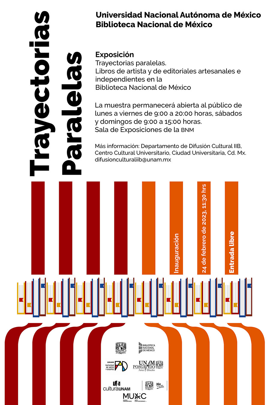
Poster for Trayectorias paralelas / Parallel trajectories. Artist's books and artisan and independent publishers at the National Library of Mexico. The exhibition is open to the public from February 24 to May 26, 2023.[1]
Mientras ahí, como detallé en la entrada del blog anterior, pude visitar una exhibición de libros de arte en la biblioteca nacional en el campus de UNAM. Luego presenté una lista de editoriales que encontré ahí. Para continuar, quisiera hablar de algunos detalles que pude encontrar en esta exhibición.
Una cosa interesante que surge de hablar del género de libro de arte en castellano/español es que el término artist book tiene dos equivalentes en castellano, el uno libro de arte y el otro libro de artista. En castellano no hay necesidad de debate sobre dónde poner el apostrofe en su ortografía porque la pregunta no se trata de quien hizo el libro, sino de cantidad y género en la gramática castellana/española.
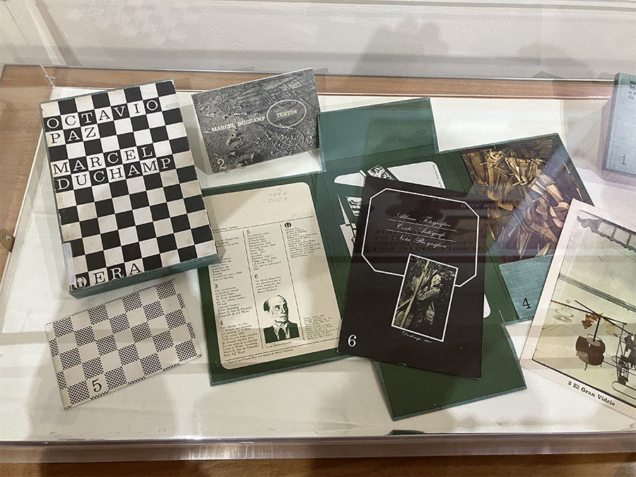
Octavio Paz. Marcel Duchamp O El Castillo de la Pureza (Marcel Duchamp Or The Castle of Purity). 1968.
Unas obras sorprendentes que incluyeron en la exhibición fueron: Un libro del autor mexicano Octavio Paz (1914 – 1998) que se trata de la obra de Marcel Duchamp (1887 - 1968) de 1968. Estoy esperando poder acceder a una copia para aprender más de ella.

Octavio Paz y Vicente Rojo. Discos Visuales (Visual Discs). 1968.
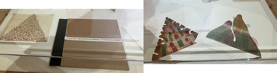
Vicente Serrano y Vicente Rojo. Prosa del Popocatépetl (Popocatépetl Prose) 2003.
Otras sorpresas fueron dos libros creados por colaboración entre el pintor español-mexicano Vicente Rojo (1932 – 2021) con Octavio Paz de 1968 y con el poeta mexicano Vicente Serrano (n. 1949) de 2003.
Por supuesto, con tan solo estar ahí un puñado de días no pude profundizar mucho en el asunto de la historia de estas obras. Eso entendido, quisiera relatar algunas cosas que me resultaron fascinantes de esta exhibición.
Fechas
Las obras de esta exhibición incluyen un amplio rango de fechas, desde 1792 hasta 2023, con la mayoría creada desde 2016, la mayoría de las cuales eran de 2022. Por si acaso Uds. no supieran, la primera imprenta europeo en las américas estuvo fundada en la Ciudad de México en 1539. También, hay una historia aún más larga antes de eso, que incluye la creación conocida, y desconocida, de códices creados por las culturas anteriores al encuentro europeo con las culturas de México y la América Central. Esta larga historia de la elaboración de libros en las Américas representa una necesidad paralela al desarrollo histórico de la información portátil por todo el mundo.
Diversidad
A pesar de que la exhibición está en la capital nacional de México, hay obras de todo el país y hasta de artistas de libro de otros países, como Venezuela, quienes ya viven en México.
Cuestiones estéticas
En los textos presentados en los 4 afiches grandes en las paredes de la exhibición los organizadores de esta muestra hablan de los libros de artista como “extensión … de la memoria.” Hablan de cómo el libro, por medio del arte nuevo de hacer libros, ahora incluye “experimentar con otras estructuras que producen distintas modalidades de lectura: cajas, biombos, pop-ups, carruseles.” Incluso habla del uso de “diversas prácticas artísticas, como la pintura, el grabado, la fotografía, la escultura” y de “alejarse de las lógicas de producción y distribución comerciales, con lo que se abre nuevos caminos.” También habla de “editoriales artesanales e independientes” y la gran “variedad de formas, materiales, formatos y estructuras que el objeto libro ha tenido tanto en el presente como a lo largo de su historia.” Esta exhibición presenta “ejemplares históricos” y “el resto de la historia del libro” [2] en diálogo paralelo. Estas cuestiones clásicas de la producción y teoría de los libros de arte son de gran importancia no solo en México sino por todo el mundo. Todavía tenemos que reconocer que la producción del libro de artista y su interpretación y reinterpretación es una práctica tan universal como la de leer, desear saber y aprender. No hay fronteras ni límites en tal búsqueda.
¡Adelante!

Giovine, et al. “Presentación (Presentation).” afiche de la exposición Trayectorias Paralelas, 2023.
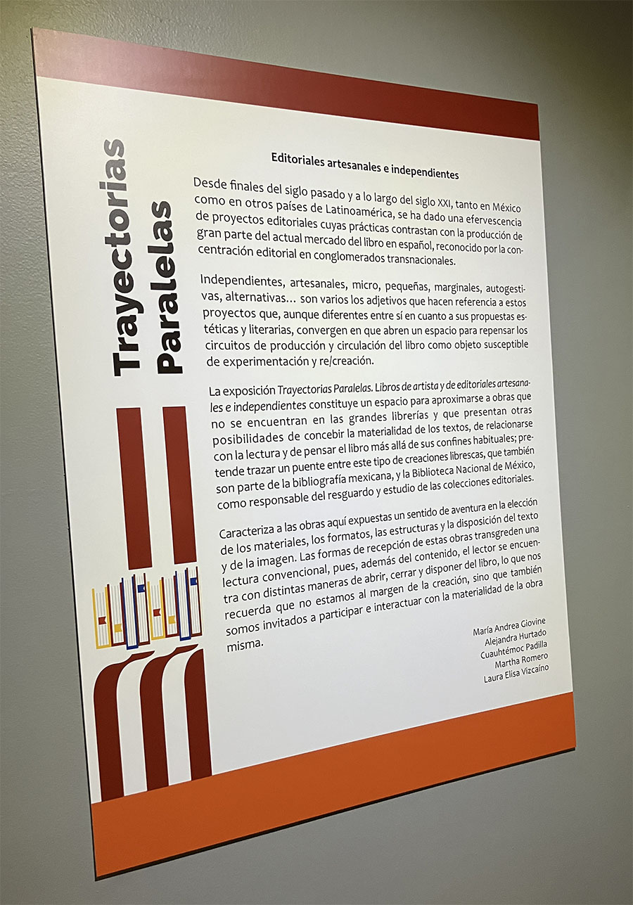
Giovine, et al. “Editoriales artesanales e independientes (Artisan and Independent Publishers).” afiche de la exposición Trayectorias Paralelas, 2023.

Giovine, et al. “Libros de artista del MUAC (Artist Books at the University Museum of Contemporary Art).” afiche de la exposición Trayectorias Paralelas, 2023.
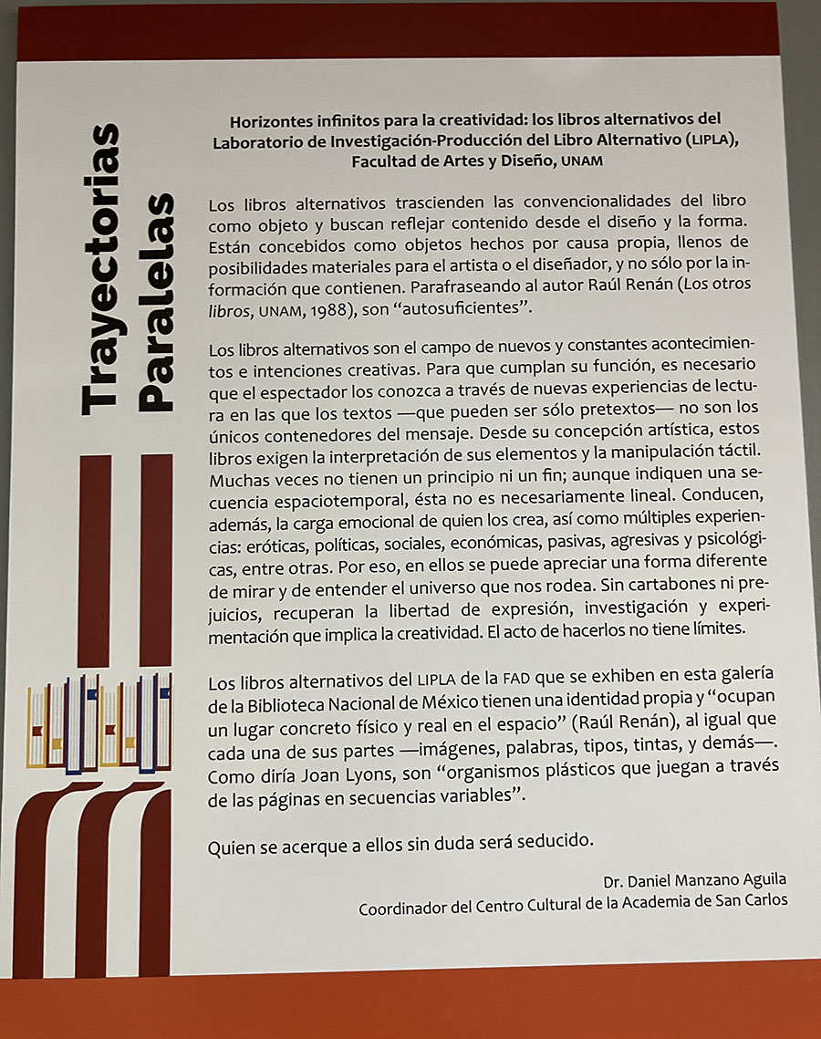
Giovine, et al. “Horizontes infinitos para la creatividad (Infinite Horizons of Creativity).” afiche de la exposición Trayectorias Paralelas, 2023.
Recently I was in Mexico City. While I was there, I saw many things that I had desired to see for a long time, including the Aztec Sun Stone and the Monumental Cuatlicue, Olmec monumental heads, the Chapultepec Castle, murals done by the three great Mexican muralists, Orozco, Siquieros, y Rivera, the campus of the Universidad Nacional Autónoma de México (UNAM), and the Mexican Folk Ballet in the Palace of Fine Arts. It was impressive to see and contemplate all the history shared and embodied by these artifacts, art works, and spectacles contained in this cosmopolitan cultural center that is as universal as it is unique.
There is a phrase in a religious book that I read that says that everything that was written in that book represents only a small measure of all the knowledge concerning the culture that made the book, so that their descendants would know something that has to do with their ancestors. Of all that is known of the past, we cannot understand even a hundredth part of everything that happened among any previous culture and its people. That is how I felt contemplating what we know and don’t know about the history of Mexico that is both contained, and absent, from its books.
While I was there, as I described in the previous blog post, I was able to visit an artist book exhibit at the national library on the campus of UNAM. I then included a list of publishers that I found there. To continue, I would like to talk about some details that stood out to me from that exhibition.
One interesting thing that arises from talking about the artist book genre in Spanish is that the term artist book has a primary equivalent in Spanish, libro de artista (artist book). In Spanish there is no need for a debate about where to put an apostrophe in spelling the term because the question is not one about who made the book, but about quantity and gender in Spanish grammar.
Some surprising works that were included in this exhibition were: A book by the Mexican author Octavio Paz (1914 - 1998) that is about the work of Marcel Duchamp (1887 - 1968) from 1968. I am currently waiting to get access to a copy to learn more about it.
Some other surprises were two books created in collaboration by the Spanish-Mexican painter Vicente Rojo (1932 - 2021) with Octavio Paz from 1968 and another work by Rojo with the Mexican poet Vicente Serrano (b. 1949) from 2003.
Of course, because I was only there a handful of days I did not have time for any deep research into the history of these works. That said, I would like to share some other things that I found fascinating about this exhibition.
Dates
The works in this exhibition include a broad range of dates, from 1792 until 2023, with the majority of them created since 2016, the majority of which were from 2022. Just in case you did not know, the first European printing press in the Americas was established in Mexico City in 1539. There is also an even longer history before that, that includes the creation of known, and unknown, codices created by the pre-contact cultures of Mexico and Central America. This long history of book creation in the Americas presents a parallel historic need for the development of portable information all over the globe.
Diversity
Despite the fact that the exhibition is in the national capital of Mexico, there are works from all over the country and even book artists from other countries, like Venezuela, who now live in Mexico.
Aesthetic Questions
In the texts presented on the 4 large posters on the walls of the exhibition, the organizers of the show talk about artist books as an “extension … of memory.” They talk about how the book, through the new art of making books, now includes “experimenting with other structures that produce different reading modalities: boxes, screens, pop-ups, carousels.” They even talk about the use of “various artistic practices, such as painting, engraving, photography, sculpture” and “Moving away from the logic of commercial production and distribution, thus opening up new paths.” They also address “artisanal and independent publishers” and the great “variety of shapes, materials, formats, and structures that the book object has had both in the present and throughout its history.” This exhibition presents “historical works” and “the rest of the history of the book” [2] as parallel dialogues. These classic questions of the production and theory of artist books are of great importance, not only in Mexico but throughout the world. We still have to recognize that the creation of the artist book and its interpretation, and reinterpretation, is as universal a practice as reading, seeking knowledge, and learning. There are no borders or limits in such a quest.
¡Adelante!
Obras citadas/Works cited:
[1] Exposición: “Trayectorias paralelas. Libros de artista y de editoriales artesanales e independientes en la Biblioteca Nacional de México.”Accessed May 9, 2023. https://www.iib.unam.mx/index.php/instituto-de-investigaciones-bibliograficas/difusion-y-docencia/exposiciones/888-exposicion-trayectorias-paralelas-libros-de-artista-y-de-editoriales-artesanales-e-independientes-en-la-biblioteca-nacional-de-mexico
[2] Giovine, María Andrea, Alejandra Hurtado, Cuauhtémoc Padilla, Martha Romero, y Laura Elisa Viscaíno. “Presentacion.” afiche de la exposición Trayectorias paralelas. Libros de artista y de editoriales artesanales e independientes en la Biblioteca Nacional de México, 2023.
Peter Tanner is an Associate Instructor in Spanish at the University of Utah and Editor of Openings: Studies in Book Art. He has a Ph.D. in Latin American literature, an MA in Latin American Art History, and a BFA in Painting and Printmaking. His research focuses on artist books from Latin America.