There is a prevalence of infographics about artists' books. Infographics that display an inheritance from dematerialized/conceptual art; infographics that describe and demarcate the field of artists’ books; infographics that fulfill the need to communicate about a medium that is both spatial and time-based; infographics that function to teach bookbinding and letterpress printing (book arts). Why are there so many infographics about artists’ books? What do they tell us about or offer to the field of book arts?
Is this unique to artists’ books? Are we in a field obsessed with defining itself? And what we might learn by surveying them?
In order to answer some of the preliminary questions we looked at a set of example infographics and attempted to organize them according to "circles of meaning." Being that infographics are spatial, playful, and reductive, we agreed to start with mimicry in order to better understand how they function.
In terms of data visualization, the relationship between the bookbinding worksheet and a manual for machinery is that both are pragmatic and a sort of meta-publication. Maybe this connection is related to design practices. Design practices stem (partly) from necessity (the need to organize and plot out on paper where to print, fold, bind when there are so many planes of existence in a book format), but also include the artistic impulse to visually manifest an abstract idea or emotion. It’s possible that these book arts infographics are a result of the artistic/design impulse to create a visual, as well as practical, guide for a field that has its foundations in an existing form or medium (the book). The inherent interdisciplinarity of artists’ books and its conception/metaphorization as a “field” or a zone of intersection lends itself to spatial representation, and, the ongoing concern with self-definition and self-examination continues to produce infographics in this vein.
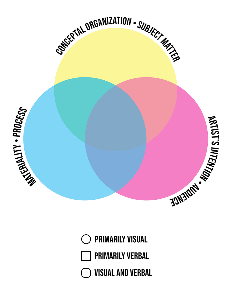
We evaluated the sample infographics and placed them into 3 large categories: Materiality/Process; Conceptual Organization/Subject Matter; Artist’s Intention/Audience.
The resulting diagram brings up a few key ideas:
1. artists' books are interdisciplinary, so it makes sense that the liminal spaces and boundaries will be important (even if they aren't represented)
2. the point of a structuralist exercise might be to see the limits of discourse, i.e., what positions in the graphic ought to be populated and, if they aren't, what (social or material) factors are preventing them from being populated?
3. if the infographics are indeed reductive, how has that affected the field's self-conception?
We propose using this Venn diagram to gauge infographics about book arts in the same way we would use those book arts infographics to gauge the bookishness of art or the artiness of books. Maybe this infographic becomes a way to talk about the types of critical theory and language used when discussing book arts and brings up larger ideas about the gaps. It will be interesting to see how people plot the various infographics on the structure we’ve created; we anticipate that some will be straightforward and others will be controversial. For example, Smith's conceptual books could be all about artist's intent and thus about artist/audience...but of course that is inherently contrasted to materiality and process, etc.
In the spirit of book arts as an experiential art form, we would like to take this opportunity to ask the reader to participate in this exercise by deciding where each of the linked diagrams might fit.
Levi Sherman is a PhD student in Art History at the University of Wisconsin–Madison, and the founder of Artists’ Book Reviews.
AB Gorham is a book artist and writer from Montana. She is the Director of Black Rock Press where she teaches book arts in the Book and Publication Arts Program. Her artist books have been exhibited and collected nationally.