During this extended time of ‘sheltering in place’ I have been re-examining artists’ books in my collection. Johanna Drucker’s The Word Made Flesh is a marvel of type play, like an enigmatic, poetic crossword puzzle. I have the facsimile reprint of the original letterpress edition. The inherent quality of the large wood letters and metal type were kept in the offset version, printed on a Heidelberg GTO in 1996. Johanna hand printed the book jacket from polymer letterpress plates at Druckwerk in New Haven; and it was published by Granary Books. She believed the second cover was more sympathetic to the aesthetic tone of the interior pages. Each letter of the title The Word Made Flesh is featured per page, five-inches high in a field of small red type. The background text quotes sacred and secular passages at once both literal and allusive. The spaced, red lettered ground is difficult to read, forcing me to read the way my mother reads—one letter at a time, due to macular degeneration. Indeed, Drucker states, “The typographic format of the Word Made Flesh was meant to trip the eye, return one constantly to the plane of discourse, of material production” (Artists' Books Online).
During my fellowship at Yale, Johanna told me that she was influenced by the 8th century monk, Hrabanus Maurus. His illuminated manuscripts have fields of evenly spaced text from which emerge sacred figures. The format of her book, “invokes a reference to the carmina figurata of the Renaissance—works in which a sacred image was picked out in red letters against a field of black type so that a holy figure could be seen and meditated on in the process of reading” (cover notes). Drucker made the book “out of a complete love of letters…. [an] absolute celebration of the beauty and expressive capability of type” (Artists’ Books Online). The large black letters arranged like figures on a red ground announce their materiality—visceral, earthy, and emotive embodying tongue, breath, and flesh. Language becomes matter/material/image.
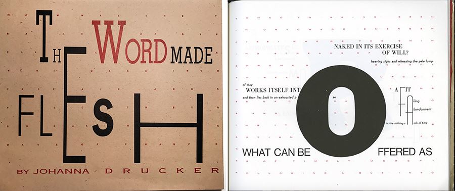
Johanna Drucker, The Word Made Flesh, letterpress cover with offset interior page.

Hrabanus Maurus, De Laudibus sanctae crucis, manuscript, 11thc. for the abbey of Saint-Denis, held by Bibliothèque nationale de France.
Her title The Word Made Flesh, points to the first century Biblical book, The Gospel According to John, “the Word became flesh and lived among us, …, full of grace and truth” (1:14). Incarnation Theology is the doctrine that Jesus Christ assumed human form and is completely both God and man. Reinforcing the religious overtone, Drucker states that text and materiality, “the two are intimately bound, in the incarnate word” shown in her artist’s book and that “the black texts are meant to "figure" against the red ground, as the images of Christ, a cross, or other devotional images are called out in carmina figurata” (Artists’ Books Online, editions).
De Laudibus Sanctae Crucis (In Praise of the Holy Cross) is the only poetic work of the prolific scholar Hrabanus Maurus (780-856), one of the greatest teachers of the Carolingian period. As abbot, the Benedictine monastery of Fulda housed around 600 monks and became a preeminent center of scholarship and book production. Maurus’ De Laudibus is comprised of thirty figured poems that draw on the ancient tradition of Greek pattern poetry that we looked at in the last blog. The elaborate work embodies and celebrates the cross with verse forming the grid of letters from which emerges new words, phrases, shapes and figures. Geometric shapes, circles, triangles, squares and more figure prominently in the series often in a cruciform pattern. Composed around 810, the manuscript exists in several exquisite copies: one thought to have been done under the direction of Maurus himself for the abbey of Saint-Denis in France, which is now in the Bibliothèque nationale de France seen at the Public Domain Review. Another notable version held by the Vatican features many pages in deep purples with lighter type. And a strikingly brighter, Christ figure lined in black text emerges from a golden field of red letters. The British Library’s 12th-century copy features decorative borders with pristine spaced black lettering (www.publicdomainreview.org).
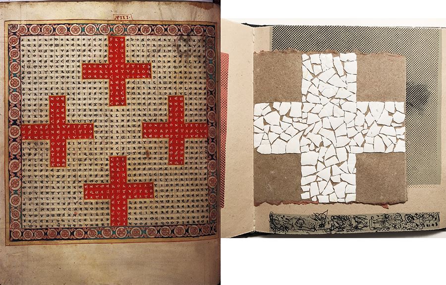
Left: Hrabanus Maurus, Four red crosses from De Laudibus, 10thc., British Library.
Right: Robbin Ami Silverberg, Memorial, eggshell fragment cross, printed by Beles, 1998.

Robbin Ami Silverberg, Memorial, eggshells, needle threader, handmade papers.
Maurus’ thirteenth figural poem, bordered by foliate roundels, depicts four red crosses arranged in a cross pattern. The intricate texture of white lettering in the equal-armed Greek cross, also known as the square cross or peaceful cross reminded me of another book in my collection, Robbin Ami Silverberg’s Memorial. The book is a deep lament in grays and reds formed from alternating small squares nested in larger squares of deckled handmade papers. An exquisite square cross is formed by broken eggshells, followed in sequence by two squares of brown eggshells. Some pages have eggshell fragments, some painstakingly stippled with black ink. Dark halftone dot textures from photographic images are printed on paper and on film. The colophon states that the book was printed by Beles, Mor Art Residency, Hungary. One graffiti fragment forbodes, “the living are the dead on vacation.” The dark pacing and intricate textures build layer upon layer to create a profound remembrance, similar in this way to the carmina figurata of Hrabanus Maurus. Robbin Ami Silverbergis known for her artist books on anamnesis, the opposite of forgetting. Her thirty-year retrospective at Pratt Institute, Brooklyn Campus show the “two major lines she is following… in her abstract yet poetic work, intersecting time and again within it: the facets of remembering and forgetting, memorial and loss” (Susan Padberg, catalog essay for Read Me, Like a Book). 2020 is the 30th anniversary of Robbin Ami Silverberg, artist and founding director of Dobbin Mill, a hand-papermaking studio, and Dobbin Books, a collaborative artist book studio. View the thoughtful site-specific virtual online tour at Read Me. Like a Book, 30 years of Dobbin Books.
KT Hettinga is an award-winning artist in design, artist’s books, digital images/prints, and photography. Twice awarded the Distinguished Professor of Art, she designs for non-profits. Her books are in collections from NMWA to UCLA. Residencies include: Yale Research Fellow, Luce Center for Arts and Religion, Pyramid Atlantic, WSW and VSW.